

When I talk with my patients at the clinic, I see this problem all the time. They feel overwhelmed by conflicting information about a healthy diet. What they’re looking for is a simple, evidence-backed guide to know what to put on their plate.
And that’s what the Food Pyramid was supposed to be. But it was actually a bit of a mess, which is why it was finally abandoned. There’s a much better alternative, though. It was developed by scientists at Harvard. And it’s the guide I share with my patients.
So let me explain what it says and unpack some of the research that backs it up.
Table of Contents
- History
- Problems with the USDA Food Pyramid
- The MyPlate Update
- Harvard’s Healthy Eating Plate
- Protein Recommendations
- Whole Grains vs. Refined Grains
- Vegetables and Potassium
- Healthy Fats vs. Unhealthy Fats
- The Dairy Debate
- Final Thoughts
- References
History
The USDA’s Food Pyramid came out in 1992. It followed several attempts to represent healthy eating in graphical form. For instance, there had been the Basic Seven in the 1940s—a circle divided into 7 food groups with the number of recommended servings for each.

The goal for the 1992 version was to represent up-to-date knowledge of nutrition. It also tried to visually represent how much of each food group we should eat. Things we should eat more of were placed at the bottom of the pyramid. Things we should minimize were at the top.
The bottom layer had grains and called for 6–11 servings daily. The next layer up was split between vegetables—at 3–5 servings—and fruits—at 2–4 servings. Above that were two groups at 2–3 servings each: dairy and proteins. Finally, at the top, signaling the smallest recommended intake, were fats and sweets.
Problems with the USDA Food Pyramid


The idea seems great. And visually, it’s easy to remember. But as a guide to healthy eating, it’s a bit of a disaster. Here’s what it got wrong.
Grains: The foundation of the pyramid is grains, but it doesn’t specify whole grains. It describes the group as “bread, cereal, rice & pasta,” and the image looks like it contains mostly refined foods. However, evidence shows we should minimize refined grains and boost whole grains.
Fats: The pyramid groups all fats, oils, and sweets together, suggesting they’re all equally bad. But that’s not true. Healthy fats like olive oil and nuts are crucial for health.
Protein Sources: The pyramid lumps meat, poultry, fish, beans, eggs, and nuts into one group without distinguishing between healthy and unhealthy options. Someone could meet the recommended intake with just sausage or red meat—foods linked with increased disease risk.
Dairy: There’s no strong evidence supporting 2–3 servings of dairy daily, and it doesn’t clarify which types of dairy to avoid.
Servings Confusion: The pyramid uses “servings” as its unit, but most people don’t know what that looks like on their plate.
To be fair, the USDA did know better in some cases. The 1990 Dietary Guidelines, which informed the pyramid, made distinctions like recommending low saturated fat intake. But the visual pyramid didn’t convey this nuance. As a result, it failed its mission, and the FDA abandoned it in 2011.
The MyPlate Update
The USDA replaced the food pyramid with MyPlate—a visual of a plate divided into four sections: fruits, vegetables, grains, and protein, with a cup labeled “dairy” on the side.

This version is a definite improvement. It’s much easier to understand portion balance at a glance. Grains are no longer the overwhelming base. But we can still do better.
What's the Healthiest Diet for You Specifically?
The best diet depends on your blood tests, health conditions, and goals — not just generic guidelines. Get personalized nutrition recommendations.
Get Your Personalized Health PlanThe diagram doesn’t make all the necessary distinctions. For instance, the fine print mentions that only 50% of grains should be whole grains. But most people won’t read the fine print.
That’s why I recommend Harvard’s version.
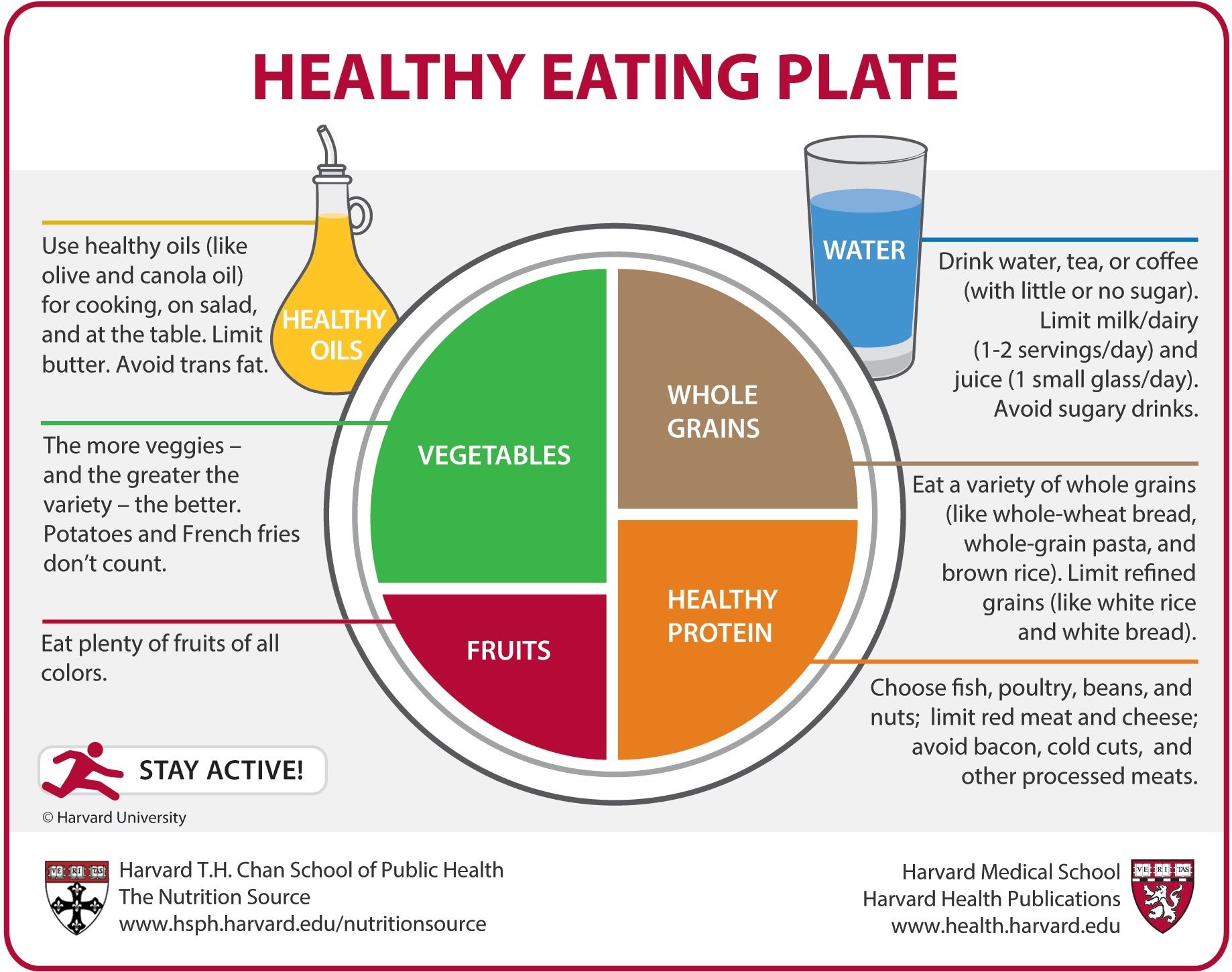
Harvard’s Healthy Eating Plate
Scientists at the Harvard School of Public Health created a diagram similar to MyPlate, but with key improvements.

Protein: Harvard uses the term “healthy protein” and specifies what that means—fatty fish, chicken, beans, legumes, and nuts. They advise avoiding red and processed meats. The protein portion is slightly larger than MyPlate’s.
So how much protein should we get?
Protein Recommendations
There’s a lot of debate here. One common recommendation is 1.6 g/kg of ideal body weight per day. On the flip side, Dr. Valter Longo suggests around 0.8 g/kg or less, citing cancer risk.

Why the difference?
Higher protein intake supports muscle mass, which declines significantly with age—up to 50% loss between age 40 and 80. In fact, muscle mass loss can begin as early as our 30s, and it accelerates with illness or extended bed rest. These declines can reduce mobility, quality of life, and increase the risk of fall-related injuries.
An international expert group recommends 1.0–1.2 g/kg/day for people over 65. One study showed older adults consuming 1.1 g/kg lost 40% less lean body mass over 3 years than those who ate 0.8 g/kg.

For building muscle, 1.3 g/kg/day appears to be the sweet spot. Personally, I aim for 1.2 g/kg.
Higher protein intake also helps with weight loss. A meta-analysis showed that high-protein diets led to greater fat loss, less muscle loss, and better lean mass retention—even with equal total calories.
But Dr. Longo’s concerns center on cancer. One of his studies found that high protein intake was associated with a 74% increase in all-cause mortality and a 4x greater risk of cancer death in adults aged 50–65.

Crucially, the risk was tied to animal protein, not plant protein. Another large study confirmed this: animal protein increased mortality risk by 52%, while plant protein lowered it by 36%.
Fish protein, especially from fatty fish, actually reduced mortality risk. And a BMJ meta-analysis concluded that total protein intake was linked with lower all-cause mortality—with no increase in cancer mortality—especially when the protein was plant-based.
Conclusion: Aim for ~1.2 g/kg/day and focus on plant-based and fatty fish sources. Avoid red and processed meats.
Whole Grains vs. Refined Grains
Harvard’s plate advises limiting refined grains and choosing only whole grains.
Refined grains strip away fiber, vitamins, and nutrients. A 14-year cohort study with 367,000+ participants showed those who ate the most whole grains had a 17% lower all-cause mortality risk and up to 48% lower risk from specific diseases.

Fiber itself is a powerhouse. A Lancet meta-analysis found that high-fiber diets reduced all-cause and cardiovascular death by 15–30%.
It also helps with weight. Eating just 14 g more fiber per day led to a 10% drop in calorie intake and almost 2 kg of weight loss over 3.8 months.
While fiber is great for most, those with IBS may need to limit it. For the general population, more fiber is better. Personally, I include 2.5 g of psyllium husk—a potent fiber source—in my MicroVitamin+ Powder, though you can get similar benefits through food sources if you prefer.
Vegetables and Potassium
MyPlate’s visual emphasizes vegetables well, but doesn’t distinguish between kinds. Harvard clarifies: potatoes and fries don’t count.
We want a variety of green and colorful vegetables like spinach, broccoli, carrots, and tomatoes. These provide essential nutrients like potassium and magnesium.

Potassium plays a huge role in blood pressure. A meta-analysis found that increasing potassium intake reduced systolic blood pressure by 3.49 mm Hg on average, and up to 7.16 mm Hg at higher doses.
Healthy Fats vs. Unhealthy Fats
MyPlate omits fats entirely. Harvard includes healthy oils and explains the difference between good and bad fats.

We now know that not all fat is bad. Trans fats and saturated fats increase disease risk, while polyunsaturated and monounsaturated fats support heart health.
Replacing saturated fats with healthy oils can reduce heart disease risk by 30%—similar to the effect of statins.
The Mediterranean diet, high in extra-virgin olive oil, is a proven winner. In the PREDIMED study, those on a Mediterranean diet with olive oil had a 31% lower risk of heart attack or stroke compared to a low-fat diet.
The Dairy Debate
MyPlate features a cup of dairy, suggesting it should be part of every meal. But the evidence for three servings a day isn’t strong.
Yes, dairy provides calcium, protein, and other nutrients. But a meta-analysis showed no consistent benefit for bone density or hip fracture risk—though it may reduce vertebral fractures.
Harvard replaces the dairy cup with a glass of water and reminds us to avoid sugary drinks.
Final Thoughts
The Harvard version of MyPlate is a powerful, evidence-based visual guide to healthy eating. It’s the one I recommend to my patients.
But even though this guide is useful, when I want to make things as easy as possible, I advise my patients to simply prioritize 3 food types. We have a ton of evidence showing these can increase lifespan and healthspan.
Watch the next article for the ultimate shortcut in planning meals that boost health.
What's the Healthiest Diet for You Specifically?
The best diet depends on your blood tests, health conditions, and goals — not just generic guidelines. Get personalized nutrition recommendations.
Get Your Personalized Health PlanReferences
1. https://digital.library.unt.edu/ark:/67531/metadc619/m1/1/med_res/
2. https://www.britannica.com/science/food-pyramid
3. https://www.uptodate.com/contents/healthy-diet-in-adults
4. https://www.dietaryguidelines.gov/about-dietary-guidelines/previous-editions/1995-dietary-guidelines
5. https://www.myplate.gov/resources/graphics/myplate-graphics
6. https://nutritionsource.hsph.harvard.edu/wp-content/uploads/2012/09/HEPJan2015.jpg
7. https://pmc.ncbi.nlm.nih.gov/articles/PMC5872778/
8. https://pmc.ncbi.nlm.nih.gov/articles/PMC6442923/
9. https://pmc.ncbi.nlm.nih.gov/articles/PMC7727026/
10. https://pmc.ncbi.nlm.nih.gov/articles/PMC7539343/
11. https://pmc.ncbi.nlm.nih.gov/articles/PMC3988204/
12. https://www.nature.com/articles/s41598-023-30455-9
13. https://pmc.ncbi.nlm.nih.gov/articles/PMC7374797/
14. https://pmc.ncbi.nlm.nih.gov/articles/PMC4371798/
15. https://pubmed.ncbi.nlm.nih.gov/30638909/
16. https://pubmed.ncbi.nlm.nih.gov/11396693
17. https://www.bmj.com/content/346/bmj.f1378.long
18. https://pubmed.ncbi.nlm.nih.gov/28620111/


