
The Food Pyramid is probably the most widely recognized guide to healthy nutrition, yet doctors raised worries from the start. In this article, we’ll look at why it was eventually abandoned. I’ll also reveal why its replacement can still be problematic and what you need to know to make sure you’re putting the best meal for your health on your plate.
Table of Contents
History
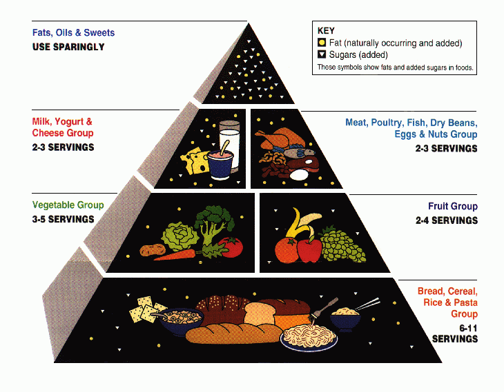
The USDA’s Food Pyramid debuted in 1992, following several attempts to present healthy eating in graphical form. A notable predecessor was the Basic Seven in the 1940s — a circle divided into seven food groups with recommended servings for each [1].

The 1992 pyramid aimed to reflect up-to-date nutrition knowledge and to show, visually, how much of each food group we should eat. Foods we should eat more of were placed at the bottom, while foods to minimize were placed at the top.
The bottom layer held grains and called for 6–11 servings daily. Above it, vegetables (3–5 servings) sat beside fruits (2–4 servings). The next tier combined dairy and proteins at 2–3 servings each. Fats and sweets occupied the tiny apex [2][3].
Problems
The idea was sound and the image memorable, yet as a guide to healthy eating it was a bit of a disaster. Here’s what it got wrong.

1. Grains without distinction
The foundation of the pyramid is grains, but it does not specify whole grains. The group is described as “bread, cereal, rice & pasta,” and the illustration looks dominated by refined foods. Someone could easily decide the base of their diet should be white bread, pasta, and white rice, despite strong evidence that we should minimize refined grains and boost whole-grain intake.
2. All fats lumped together
At the tiny apex, all fats, oils, and sweets are grouped together, suggesting they are equally harmful. Should we minimize donuts and candy bars? Absolutely. But fats are not all the same. Healthy unsaturated fats deserve a very different place on the plate from trans fats or sugar-laden desserts.
3. Protein treated as one broad group
The meat, poultry, fish, beans, eggs, and nuts group offers no visual help in distinguishing healthy from unhealthy choices. Someone could meet the recommendation by eating mainly sausages or ground beef, yet greater consumption of red and processed meats is consistently linked with higher disease risk and premature death [4].
4. Questionable dairy emphasis
The pyramid suggests 2–3 daily servings of dairy, even though robust evidence for such a requirement is lacking, and it makes no mention of the kinds of dairy we now know to limit.
5. Servings are hard to visualise
Everything is expressed in “servings,” but most people have no idea what 11 servings of grains look like on a real plate.
What's the Best Approach for Your Health Goals?
Diet and weight management isn't one-size-fits-all. Get personalized nutrition and lifestyle recommendations based on your blood tests and health profile.
Get Your Personalized Health PlanThe USDA actually understood some of these issues. The 1990 Dietary Guidelines for Americans — the basis for the pyramid — did distinguish saturated from unsaturated fat and recommended keeping saturated fat below 10 percent of calories [5]. Yet a single diagram was supposed to be simple, memorable, and accurate for the public. Critics argued that the 1992 pyramid failed on that last score, leading the FDA to try an update in the early 2000s before abandoning the pyramid entirely in 2011.
MyPlate
Was its successor any better? Yes — but there is still room to improve. After briefly describing it, we’ll see what the latest research says about structuring meals for optimal health.
1. The Basics of MyPlate
The USDA’s replacement, MyPlate, depicts a dinner plate divided into four sections (fruits, vegetables, grains, and protein) with a cup marked “dairy” beside it [6].

What MyPlate Gets Right
- Portion clarity: A glance shows roughly how much of each food group should land on your plate.
- Better balance: Grains no longer dwarf every other category; they are equal in size to vegetables and only a bit over a quarter of the plate.
Where It Falls Short
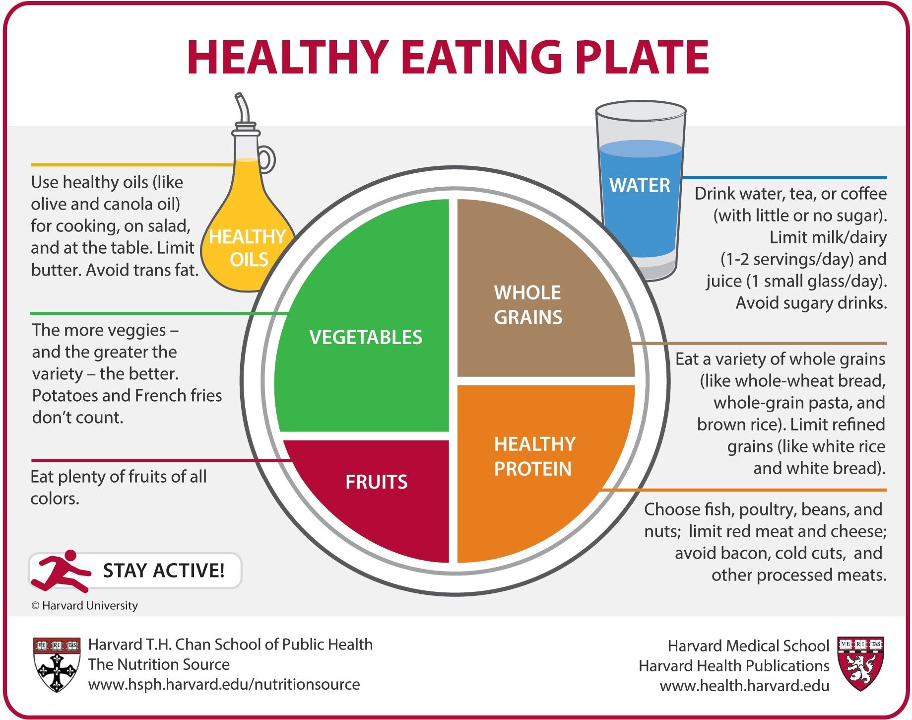
Most people never read the fine print on the government website, so any crucial nuance needs to appear on the graphic itself. Researchers at the Harvard T.H. Chan School of Public Health designed an alternative, the Healthy Eating Plate, to supply that nuance [7]. It differs in several key ways that align with current evidence.

2. Protein: Make It Healthy
Harvard’s plate labels the section Healthy Protein and steers us toward fish, poultry, beans, and nuts while advising us to limit red and processed meats, reflecting links to chronic disease [4]. The protein wedge is also slightly larger here.
How Much Protein Do We Need?
The Recommended Dietary Allowance (RDA) is 0.8 g per kg of body weight (0.36 g per lb) [8] — the bare minimum to avoid deficiency. Evidence suggests higher intakes improve satiety and increase calorie burn, aiding weight management [9]. Moreover, muscle strength declines about 1 percent per year after age 40, and lower strength predicts higher mortality [10]. Preserving muscle thus matters enormously.

A 2018 mega-analysis of 49 studies found that adding protein to the diet enhanced the gains from resistance exercise, but only up to about 1.6 g protein per kg of body weight per day [12]. Above that, benefits plateaued. For many people, reaching that level means devoting roughly one-third to one-half of total calories to healthy protein sources. Legumes such as chickpeas and lentils are favorites of mine because they also count as vegetables, keeping the plate in balance.
3. Grains: Whole, Not Refined
Harvard’s plate specifies Whole Grains. While MyPlate suggests making “half your grains whole,” evidence favours choosing whole grains almost exclusively. In a 14-year cohort of more than 350,000 participants, those who ate the most whole grains had a 17 percent lower risk of death from any cause compared with those who ate the least, and disease-specific mortality dropped as much as 48 percent [13].

Why? Fibre is central. A major Lancet meta-analysis linked higher fibre intake to a 15–30 percent reduction in deaths from cardiovascular causes, strokes, type 2 diabetes, and colorectal cancer [14]. Extra fibre also helps curb calories: each additional 14 g per day was associated with a 10 percent drop in daily intake and roughly 2 kg of weight loss over four months [15]. Most people can benefit from eating more fibre-rich foods, though those with digestive disorders should individualise intake. (I include 2.5 g of psyllium husk — a fibre powerhouse — in MicroVitamin + Powder, but supplements are optional.)
4. Vegetables (and Fruit): Variety Is Critical
MyPlate rightly gives vegetables the largest real estate. Harvard’s version clarifies that potatoes – especially French fries – do not count toward the goal [7]. Fries are deep-fried and high in unhealthy fat; even plain potatoes lack the nutrient density of leafy greens and colourful produce. Aim for a broad spectrum of vegetables and fruits: dark-green, bright-red, orange, and everything in between.

Beyond vitamins, many vegetables and fruits are strong sources of potassium. A meta-analysis of 22 randomised trials showed that increasing dietary potassium lowered systolic blood pressure by about 3.5 mm Hg on average, and by more than 7 mm Hg in people achieving 3,500–4,700 mg per day [16]. Those are meaningful changes for heart-health.
5. Fats: The Healthy and the Harmful
Fat is invisible on MyPlate, but Harvard’s plate adds Healthy Oils and reminds us to limit butter and trans fats. Not all fat is bad. Saturated and trans fats raise LDL cholesterol and heart-disease risk, whereas replacing saturated fat with poly- or monounsaturated fat can cut cardiovascular events by roughly 30 percent [17] — similar to first-generation statin therapy.
Olive oil is a prime example of a heart-healthy fat. In the PREDIMED trial, people following a Mediterranean diet rich in extra-virgin olive oil experienced a 31 percent lower rate of heart attacks and strokes than those advised to eat a low-fat diet [18].
6. Dairy: Needed, but How Much?
MyPlate shows a cup of dairy with every meal, but evidence does not clearly support three servings a day. Although dairy supplies protein, calcium, and vitamins such as B12, meta-analyses have found no consistent reduction in overall fracture risk with high dairy intake; only vertebral fractures appeared lower [19]. The Harvard plate instead places water beside the meal and reminds us to skip sugary drinks [7]. Dairy can be part of a balanced diet, but it need not dominate every plate.
Conclusion
Overall, the Harvard interpretation of MyPlate is the tool I give most often to patients:
- Fill half your plate with a colourful assortment of vegetables and fruits.
- Reserve about a quarter for whole grains.
- Use the remaining quarter for healthy proteins, leaning on fish, poultry, legumes, and nuts.
- Cook with healthy oils, favouring olive oil, and keep saturated and trans fats low.
- Drink water, tea, or coffee; limit sugary beverages.
- Include dairy if you wish, but remember that bone health depends on more than milk alone.
Adopting these simple principles — refined visually in the Healthy Eating Plate — delivers a practical, evidence-based framework for meals that support long-term health better than the old Food Pyramid ever could.
What's the Best Approach for Your Health Goals?
Diet and weight management isn't one-size-fits-all. Get personalized nutrition and lifestyle recommendations based on your blood tests and health profile.
Get Your Personalized Health PlanReferences
1. https://digital.library.unt.edu/ark:/67531/metadc619/m1/1/med_res/
2. https://www.britannica.com/science/food-pyramid
3. https://upload.wikimedia.org/wikipedia/commons/6/6d/USDA_Food_Pyramid.gif
4. https://www.uptodate.com/contents/healthy-diet-in-adults
5. https://www.dietaryguidelines.gov/about-dietary-guidelines/previous-editions/1995-dietary-guidelines
6. https://www.myplate.gov/resources/graphics/myplate-graphics
7. https://nutritionsource.hsph.harvard.edu/wp-content/uploads/2012/09/HEPJan2015.jpg
8. https://www.health.harvard.edu/blog/how-much-protein-do-you-need-every-day-201506188096
9. https://www.uptodate.com/contents/obesity-in-adults-dietary-therapy
10. https://www.ncbi.nlm.nih.gov/pmc/articles/PMC5772850/
11. https://www.ncbi.nlm.nih.gov/pmc/articles/PMC6322506/
12. https://www.ncbi.nlm.nih.gov/pmc/articles/PMC5867436/
13. https://pmc.ncbi.nlm.nih.gov/articles/PMC4371798/
14. https://pubmed.ncbi.nlm.nih.gov/30638909/
15. https://pubmed.ncbi.nlm.nih.gov/11396693/
16. https://www.bmj.com/content/346/bmj.f1378.long
17. https://pubmed.ncbi.nlm.nih.gov/28620111/


